Skip to content
The Map Den
The Map Den

Mapping the latest interests in the GIS, Mapping, geography and anything in between.

Primary Navigation Menu
Menu
  • The Map Den
  • maps
  • data visualisation
  • My Maps
  • Music Map
    • Music Map
    • Music Map: FAQs
    • Music Map: Archive
  • About

map (Page 2)

Mind the Gap (again) – Geography of the UK Train Network

2018-11-29
By: TheMole19
On: November 29, 2018
In: gis, maps, My Maps, Uncategorized
Tagged: cartography, data, data visualisation, geospatial, gis, map, mapping, Population, transport, travel, UK
With: 1 Comment

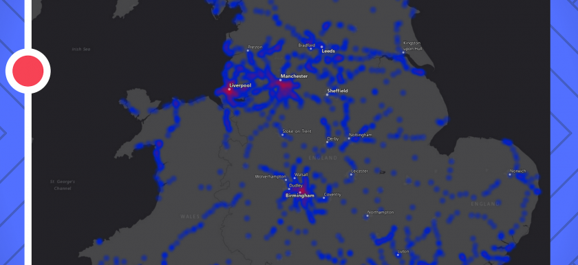
Further depth Those who’ve explored this site in the past will know that I have analysed the geography of train networks on multiple occasions, particularly in the United Kingdom. Maybe it’s my bias being a rail commuter, but it’s a topic I’m returning to again! Access to train networks shapes many people’s lives – and is two-fold. Am I near to a station and are the trains reliable? To investigate ‘access’, we start by exploring the relationship between population density and station density in the UK. Are there ‘gaps’ in train station provision? Next we examine then the temporal and spatial patterns of train punctuality.Read More →

Music and Maps

10 Bands/Artists who Love Maps – Part 1

2018-09-18
By: TheMole19
On: September 18, 2018
In: maps, My Maps, News
Tagged: cartography, culture, geography, map, maps, music, top 10
With: 2 Comments

Maps – Wait, they don’t love you like I love you Music and maps. Geography and the arts. They may or may not seem like natural partners – music is about cultural and creative expression, and the general rhythm and tune to life; the other is about precision, accuracy and scientific understanding of the processes and reality of the world around us. However, as I’ve discussed in the past, there are very strong links between the two – the list is endless of number of songs that mention ‘places’ (e.g. London Calling, Born in the USA, Straight Outta Compton etc). That’s before we consider geography’sRead More →

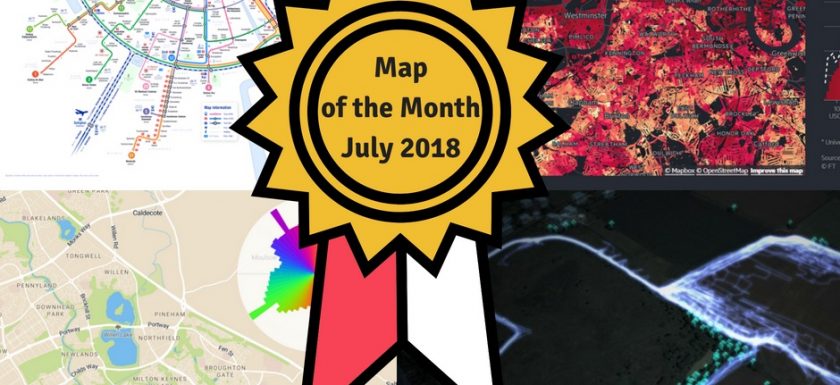
Map of The MonthJuly2018

Map of The Month – July 2018 – You Decide!

2018-07-28
By: TheMole19
On: July 28, 2018
In: Map of the Month, maps, News
Tagged: amsterdam, dogs, geospatial, gis, map, mapbox, maps, motm, netherlands, transport, UK, urban, vote
With: 0 Comments

Vote for your Favourite Map! In the first of a new series comes the (hopefully to become) prestigious Map of the Month award, where we vote on the best examples of  inspiring cartography, data visualisation and geographical science over the last month. After spending the past month trawling through the internet, I’ve whittled it down to 5 nominees for you to vote for. With geographical pride at stake, the power is with you! Let’s look at the candidates… Metro/Tram Map Amsterdam – Eric Hammink   Amsterdam is one of my favourite cities and has recently undergone updates to it’s Metro and Tram infrastructure. A first-classRead More →

Eurovision 2018 - Jury - Public Vote Difference

Eurovision 2018 – Do you need good neighbours?

2018-05-14
By: TheMole19
On: May 14, 2018
In: gis, maps, My Maps
Tagged: australia, culture, europe, geography, gis, israel, map, mapping, maps, music, politics, portugal, russia, ukraine, world
With: 1 Comment

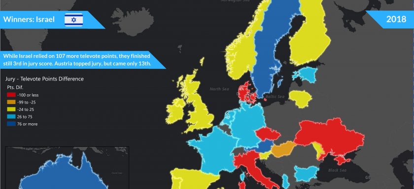
Overcoming geography While dust settles in Lisbon, after another crazy night of Eurovision revelry, we can now take time to analyse the patterns of this most geographical of contests. Netta Barzilai won the contest with the song “Toy” for Israel, overcoming it’s isolated geography and lack of neighbours, to win the Eurovision Song Contest 2018. Maybe the best song really does triumph over geography and ‘political voting’. This is a topic I have covered in the past, and while it would be naive to think this is a solely music contest – one only had to hear the audible boos when the televoting came fromRead More →

Global Chocolate Consumption per Capita (2018)

Chocolate Maps? Sweet! – Geography of Chocolate

2018-04-02
By: TheMole19
On: April 2, 2018
In: maps, My Maps
Tagged: africa, agriculture, chocolate, climate, cote d'ivoire, economics, environment, europe, geography, ghana, gis, indonesia, map, mapping, mexico, OriginalContent, politics, swizterland, UK, world
With: 0 Comments

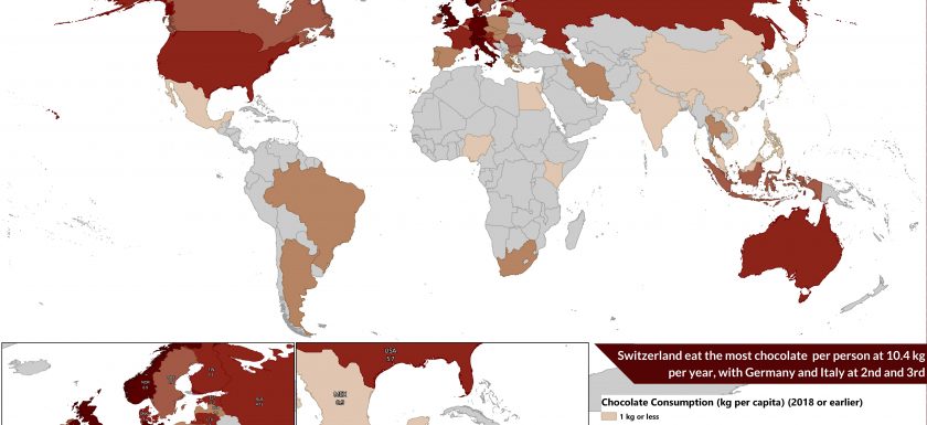
I Should Cocoa… Ugh. I’ve had too much chocolate. I’m writing this on Easter Sunday, surrounded by temptation in the form of several variations and combinations of chocolate, as is customary in the Western world at this time of year. It turns out you can have too much of a good thing – real ‘first world problems’. Talking of #firstworldproblems, chocolate addiction really is an issue for the developed world, where chocolate consumption is at its highest in this part of world – maps bear this out. So given this time of  year, I thought it would be fitting to look into the geographical patternsRead More →

USA and Gun Ownership

Holding Fire – Mapping USA’s relationship with Guns

2018-03-29
By: TheMole19
On: March 29, 2018
In: gis, maps, My Maps, News
Tagged: arcgis, cartography, crime, data visualisation, geography, gis, guns, map, mapping, safety, usa, world
With: 0 Comments

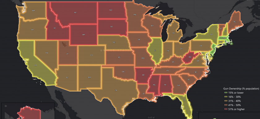
Right to keep and bear arms? The topic of firearms control and gun violence is one to approach with caution, given one, the fatalities involved, and two, that in the USA particularly, it can often stir strong debate and emotion on either side. However, following (another) mass shooting at Marjory Stoneman Douglas High School in Florida and the perhaps unprecedented public demonstrations following this in USA, and around the world, as part of ‘March For Our Lives’ – it is a topic which is hard to ignore. With the aim promoting tougher gun control legislation and raising awareness of gun violence, it has brought the debateRead More →

GlobalFishingWatch_map

Providing Depth – Mapping and Marine Wildlife Threats

2018-02-28
By: TheMole19
On: February 28, 2018
In: gis, Map of the Day, maps, Uncategorized
Tagged: data visualisation, environment, fishing, geography, geospatial, gis, map, mapping, marine, nature, ocean, satellite, sea, web development, wildlife, world
With: 0 Comments

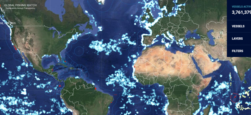
Gone fishing Quick question – what do Leonardo Di Caprio, a New Zealand data visualisation agency and David Attenborough have in common? They have all used highly effective visual tools to highlight threats to marine life*. Allow me to explain. I recently stumbled upon a striking and important interactive map from an organisation called ‘Global Fishing Watch’ (GFW), an organisation which is supported by the Leonardo Di Caprio Foundation. In the words of the Oscar winning actor himself,  “with the data Global Fishing Watch provides, governments, fishery management organizations, researchers and the fishing industry can work together to rebuild fisheries and protect critical marine habitats.”Read More →

Santa Claus Story Web Map

Where is Santa Claus From?

2017-12-22
By: TheMole19
On: December 22, 2017
In: gis, My Maps
Tagged: christmas, culture, geography, gis, history, map, mapping, netherlands, OriginalContent, santa claus, UK, usa
With: 1 Comment

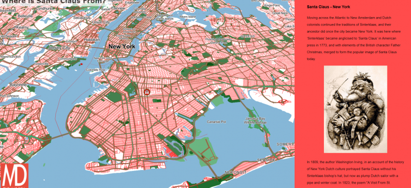
Santa Claus coming to town…via maps With Christmas coming soon and Santa preparing for his annual global delivery service of presents, I thought it would be an opportune time to investigate the origin of Santa Claus, using a story map created in Mapbox. To get the fullscreen version of the embedded map below click here, and hope you enjoy!   Finally and most importantly, Happy Christmas and have a Happy (mappy) New Year! Happy Mapping, DavidRead More →

World Average Elevation Map

On higher ground – Map of Average Elevation

2017-10-27
By: TheMole19
On: October 27, 2017
In: My Maps
Tagged: elevation, map, OriginalContent, world
With: 0 Comments

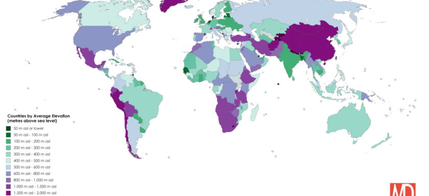
Map of Countries by Average Height above Sea LevelRead More →

Example of Carto Builder

So you want to make a web map? Part 1

2017-07-12
By: TheMole19
On: July 12, 2017
In: gis, maps, tips
Tagged: arcgis, carto, data, data visualisation, geospatial, gis, map, mapbox, mapping, maps, web development
With: 4 Comments

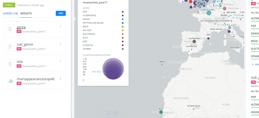
That web map looks great! Wish I could make one… In some ways, there has maybe not been a better time to be involved in the geospatial and cartographic industry, whether as a profession or as hobby/passing interest. While ‘static’ maps and images of geographical information and data visualisation are still very relevant and useful, the rise of the interactive web map is an increasingly trend which is hitting the ‘mainstream’ more and more, whether it be through maps in current affairs like election maps, or through games or social media (e.g. Pokemon Go! and SnapMap). Therefore, the ability for cartographers and geospatialists to haveRead More →

Posts pagination

Previous 1 2 3 Next

Site Menu

  • The Map Den
  • maps
  • data visualisation
  • My Maps
  • Music Map
    • Music Map
    • Music Map: FAQs
    • Music Map: Archive
  • About

Recent Posts

  • Santa Claus Travel Time Maps
  • Twas Brexit What Won It – Re: UK General Election 2019
  • UK General Election 2019 – Maps and Cartograms
  • How I made a Music Map
  • Mapping Music – Search and Explore

Tags

africa arcgis brazil canada carto cartography christmas climate culture data data visualisation economics england environment europe football geography geospatial germany gis history map mapbox mapping maps Motd music netherlands old maps OriginalContent politics Population quiz russia santa claus satellite sport transport travel UK urban usa Wales web development world

Designed using Dispatch. Powered by WordPress.