
Vote for your Favourite Map!
In the first of a new series comes the (hopefully to become) prestigious Map of the Month award, where we vote on the best examples of inspiring cartography, data visualisation and geographical science over the last month. After spending the past month trawling through the internet, I’ve whittled it down to 5 nominees for you to vote for. With geographical pride at stake, the power is with you!
Let’s look at the candidates…
Metro/Tram Map Amsterdam – Eric Hammink
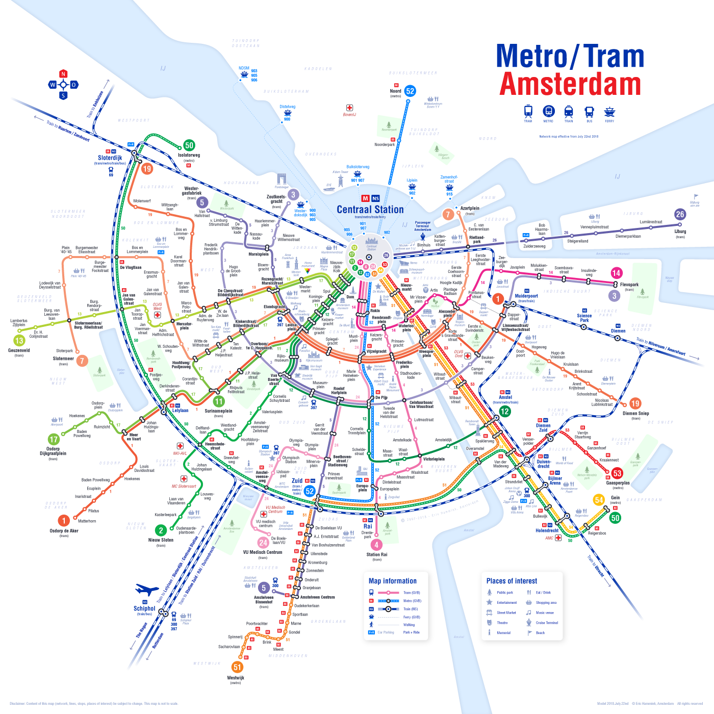
Amsterdam is one of my favourite cities and has recently undergone updates to it’s Metro and Tram infrastructure. A first-class city needs a first-class map to help navigate it, and this network map for tourists is just that. Clear and easy to follow, it builds on previous designs of Amsterdam network maps, as well as the iconic London Underground map, as well useful graphics of well-known spots. What I particularly appreciate about this design is, that in the same way the London Tube map has graphical, stylized version of the true geography and shape of the city; this builds on the circular, ring like urban pattern of Amsterdam’s streets and canals. Geweldig!
Searching for Isolation with GIS – Topi Tjukanov
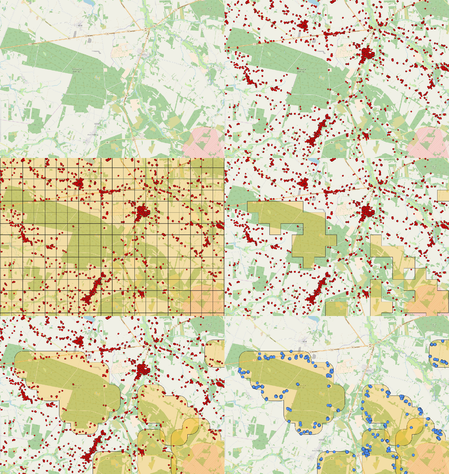
A common geographical question is “where is the nearest [insert here]”. However, the Open-Source geo-wizz Finnish geographer, Topi Tjukanov, flips that question around and searches for the most isolated points. It is a simple question, but not a simple analysis, but with the use of Voronoi polygons and other nearest neighbour techniques, he goes through step by step in this fantastic blog piece to arrive at an answer to this question. It’s not a pointless question either – it tells us something about the geographical and urban structure of a country. For example, Belgium’s most isolated point is just over 2 kilometres, whereas a less concentrated country like Finland’s is 14 kilometres. It’s the sort of inquisitive and out the box thinking geography needs.
British Broadband Speed Map – Financial Times
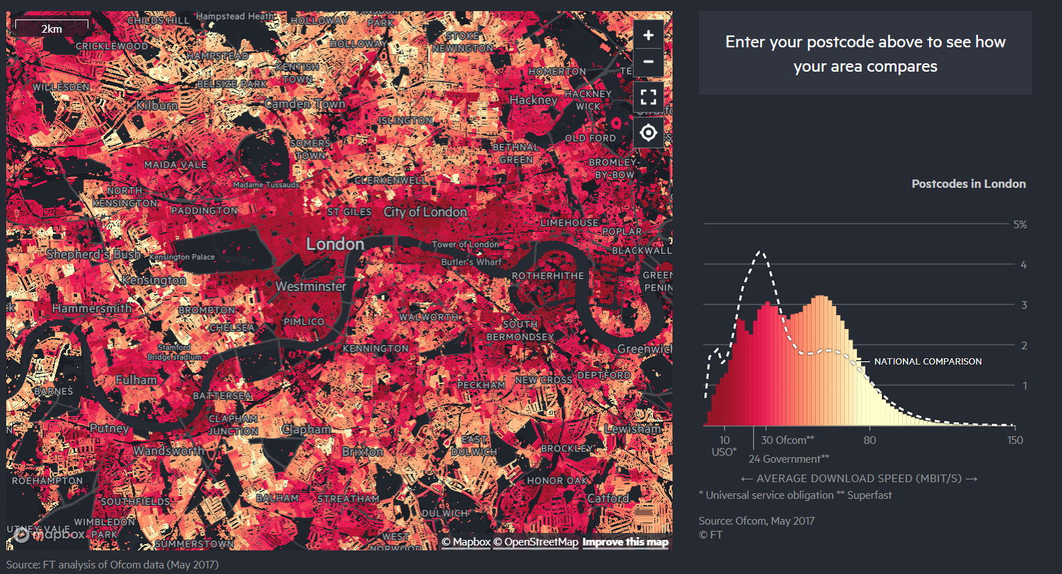
In the ‘developed’ world, internet access is seen as a neccessity – and ‘access’ isn’t just about simply being able to access the internet, but it is about adequate broadband speed. Part of my undergraduate dissertation, explored the ‘rural digital divide’, where are technological and cultural issues of poorer access to the internet. The FT have used data from Ofcom, to create an awesome interactive map and graphic tool to show differences in average internet speeds. For UK users, you can type in their postcode data, and it will zoom to a chloropleth map of your area, as well a graph displaying how your internet speed ranks compared to your local area. The article does highlight this ongoing issue of this rural digital divide, but also something else – that there is a digital divide in inner cities as well, particularly in central London. It highlights the ongoing work which is still required to improve access in the ‘information age’ all over the UK.
#Plotmypaws – Craig Taylor
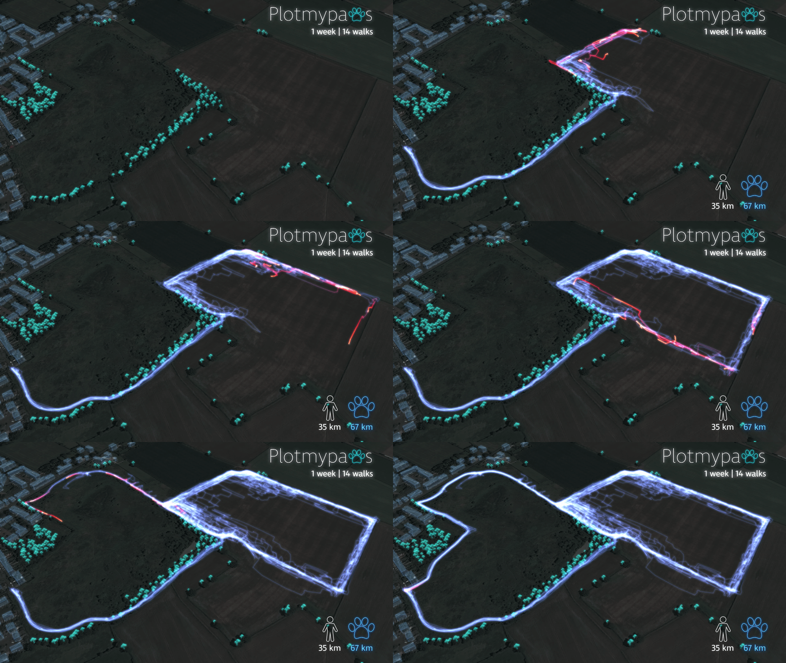
I love maps and funky data visuals, but maybe even more so, I love dogs. So when I heard about #plotmypaws from Welsh data visualisation expert Craig Taylor, I was already sold. With his adorable 7 month year old Cocker Spaniel called Bryn and a GPS tracker, he collected and displayed where he explored and what distance and patterns on his walkies! The cool, glowing and vibrant visualisations speak for themselves, but also from a data and animal behaviour perspective it is potentially useful. With different people walking him and over time the visuals show some consistencies in patterns, as well growing confidence in doggy exploration. It’d be interesting to see whether this develops over time and if it is different with different dogs.
Street Orientations – Vladimir Agafonkin / Geoff Boeing / Seth Kadish
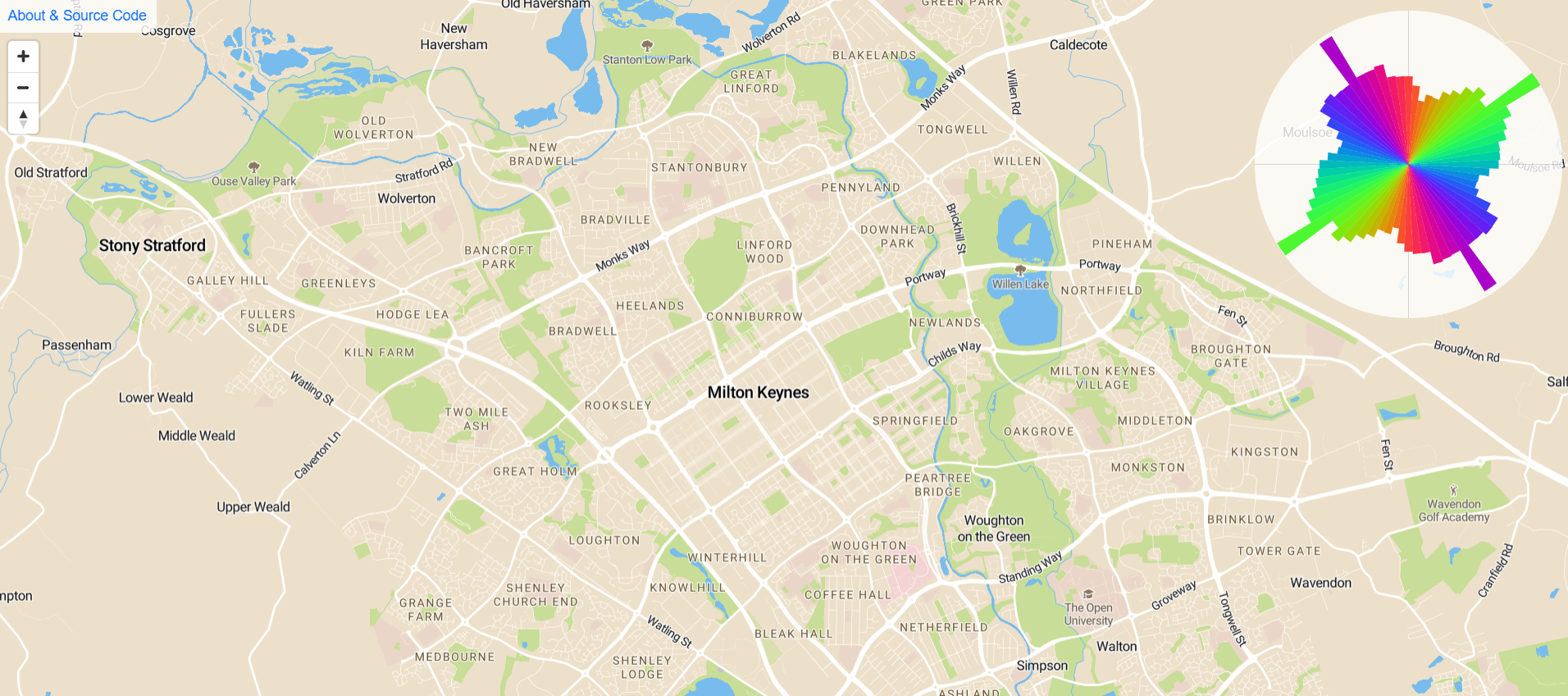
If you know of Mapbox or Leaflet.js, there’s a reasonable chance you may have heard of Vladimir Agafonkin – Ukrainian engineer at Mapbox and creator of the popular Javascript mapping platform, Leaflet.js. In other words an understated legend. So it should maybe not be a surprise that he is responsible for this clever and nifty Mapbox web map which provides instant on the fly visualisation of urban form through street orientation. Drag the map over a town/city and the orientation graphic will change to direction of where roads orientate towards. As Vladimir describes, you can get a feel about a city in the way it was planned, or unplanned as the case may be. This ‘orientation’ work builds on recent work from Geoff Boeing and Seth Kadish who created ‘polar histograms‘ , to explore urban form. It’s a simple but ingenious way of exploring urban form – one can find for instance a much more defined ‘grid’ shape in the histograms of planned cities like Milton Keynes or many in the USA, compared to older cities which grew over a longer time in a less planned manner.
Honourable mentions
London Underground depth diagrams – Dan Silva
As you can see there’s been lots of awesome geographical happenings over the last month. I can’t decide my favourite, so it’s up to you! Deadline for voting is midnight 6th August (GMT).
Happy Mapping,
David