
Gone fishing
Quick question – what do Leonardo Di Caprio, a New Zealand data visualisation agency and David Attenborough have in common? They have all used highly effective visual tools to highlight threats to marine life*. Allow me to explain.
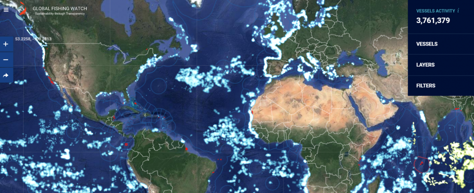
I recently stumbled upon a striking and important interactive map from an organisation called ‘Global Fishing Watch’ (GFW), an organisation which is supported by the Leonardo Di Caprio Foundation. In the words of the Oscar winning actor himself, “with the data Global Fishing Watch provides, governments, fishery management organizations, researchers and the fishing industry can work together to rebuild fisheries and protect critical marine habitats.” According to the GFW, 90% of nature’s fishing stocks have been overfished, and providing data transparency can help track behaviour of fishing vessels, including illegal fishing, promote research and sustainability. As well as keeping food supplies stable, ensuring sustainable fishing takes place helps to maintain the balance of marine habitats and food chains.
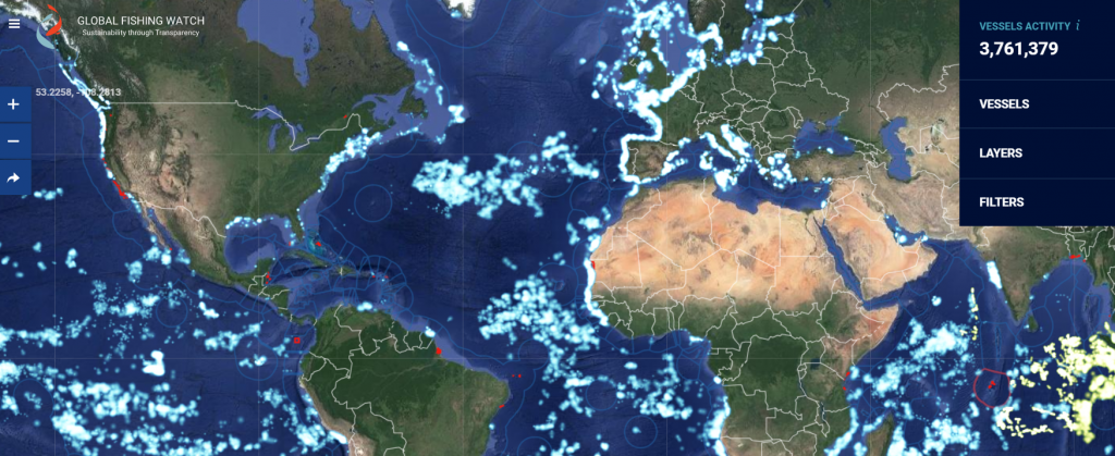
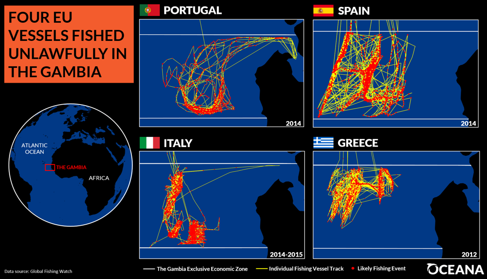
Historically, tracking patterns of fishing has not been easy or extensive enough, however using machine learning satellite ‘fishing detection algorithms’ with Automatic Identification System (AIS) tracking data, GFW has been able to produce an impressive up-to-date daily global vessel dataset. Using striking ‘glow’ visualisations (see above), you can explore where fishing vessels are, and how many, over time with a time slider tool. It has practical use too; data from GFW was used by Oceana been used to highlight and combat illegal fishing activities of EU vessels in African EEZs. Here we see, geospatial data visualisation and web development, being used with satellite machine learning – cutting edge and exciting geospatial technology providing yet another positive ‘real world’ impact.
*I admit that Leonardo Di Caprio is highly unlikely to have produced the web map, if he has, he’s even more talented than I thought!
Plastic, not fantastic
Nonetheless, this isn’t the only threat to our ocean’s wildlife. Beyond global warming, rising acidity of oceans, and many others, is the issue of plastic pollution of the seas. This issue gained wider publicity in the UK following the final episode of Blue Planet II, where David Attenborough presented how humans are impacting marine wildlife, with examples of plastic micro pollutants feeding into newly born dolphin calves through mothers contaminated milk, to larger plastic waste being unwittingly digested by sea birds. Many viewers were shocked by this and has engaged many to confront the issue of plastic waste, including influencing of government policy. However, this the issue of plastic harming marine (and terrestrial) wildlife is a global one and is not new – floating islands of plastic in the Pacific, killing over 100,000 marine mammals, have been reported as far back as 1997. New Zealand based infographic agency ‘Dumpark‘ produced an simple, but effective interactive map and data visualisation tool in 2014 to explore this issue in ‘Sailing Sea of Plastic’.
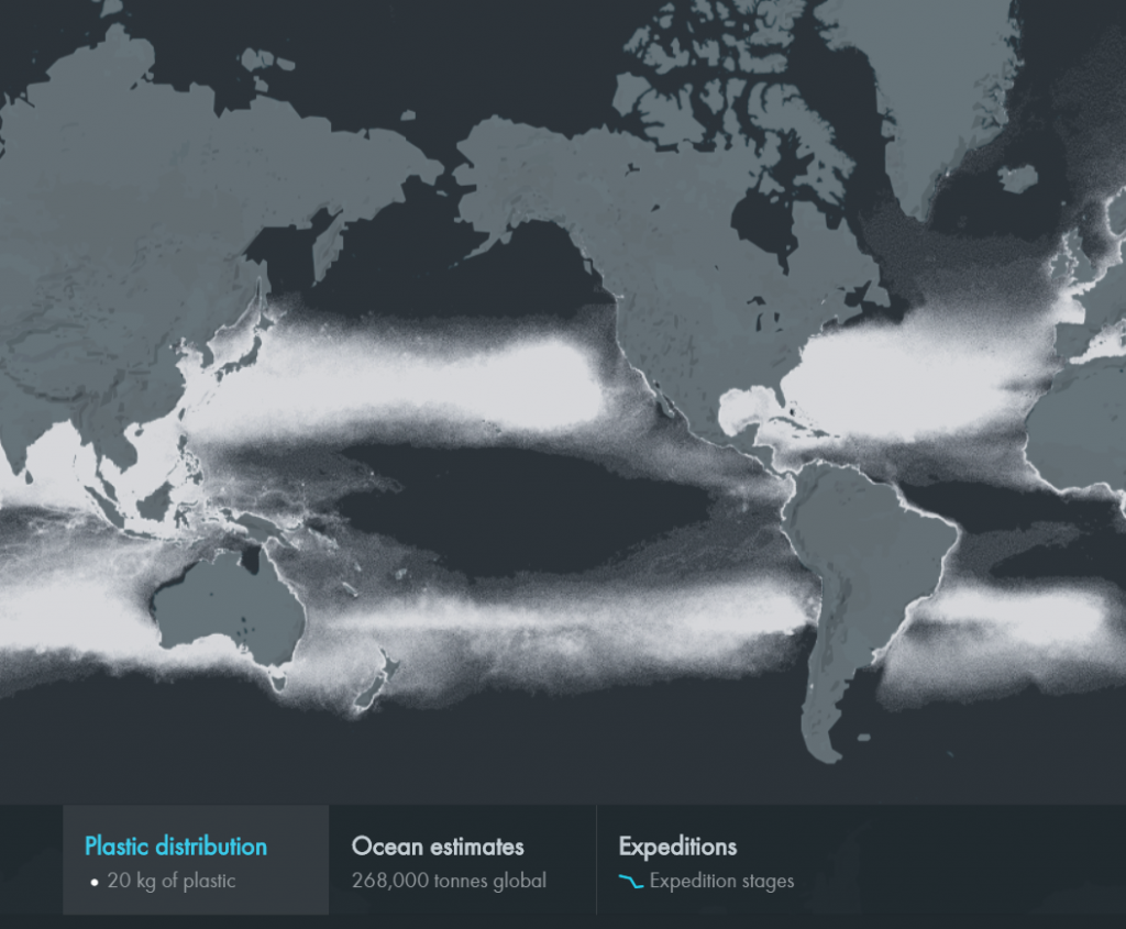
Collected from data of several research expeditions between 2007 and 2013 in association with 5Gyres, there is a distinct pattern to these seas of plastic (see above), as they follow and accumulate along shorelines and ocean currents.What is striking is that one dot on the map represents 20 kg of plastic, the high density of dots globally representing 268,000 tonnes of plastic in more than 5 trillion plastic pieces. It really highlights the severity of this issue, which is not immediately obvious from satellite imagery or to the naked eye. Sizes vary from microplastics (0-4.75mm), mesoplastics (4.75mm to 200mm) to macroplastics (>200mm) and densities of these vary too, but all can have catastrophic impacts on the world’s marine wildlife. Using Mapbox, Natural Earth data and other infographic and analytical tools, Dumpack presents this environmental issue effectively, in (literally) black and white, with clarity and simplicity.
The threats to wildlife from several sources is concerning, perhaps daunting and not easy to reverse and repair. However, we can all make our own small contribution, reusing and reducing plastic usage, or eating food which is responsibly sourced, putting political pressure, etc. The first step in this however is engagement and highlighting these issues, and often “a picture can speak a thousand words”, and the power of maps, geospatial data and visualisation to inform, engage, education and visually impact us should not be underestimated in promoting environmental causes.
Happy Mapping,
David
For more on Global Fishing Watch check out Caitlin Moran’s great article over at GIS Lounge