
Skip to content
The Map Den
The Map Den

Mapping the latest interests in the GIS, Mapping, geography and anything in between.

Primary Navigation Menu
Menu
  • The Map Den
  • maps
  • data visualisation
  • My Maps
  • Music Map
    • Music Map
    • Music Map: FAQs
    • Music Map: Archive
  • About

maps (Page 4)

Mental Wealth – Geography of Depression

2017-04-24
By: TheMole19
On: April 24, 2017
In: gis, maps, My Maps
Tagged: depression, epidemiology, gis, health, mapping, maps, mental health, OriginalContent, world
With: 0 Comments

Recently in the British news, in between snap elections and increased tensions in North Korea, there has been coverage of Prince Harry and William’s admirable openness about their mental health and drive to increase awareness about this important issue. It is totally understandable that given the sudden death of their mother in 1997, that this would have a profound impact on one’s mental health, especially given the exposure in the public eye too. Mental health problems aren’t rare; they affect 1 in 4 of UK population with no single cause. While there is variation by socioeconomic position and genetic predisposition, illnesses like depression and anxietyRead More →
Football and Economics – A good match?

2017-03-24
By: TheMole19
On: March 24, 2017
In: gis, maps, My Maps
Tagged: arcgis, brazil, culture, economics, england, football, futbol, gis, mapbox, mapping, maps, politcs, soccer, sport, uruguay, voetbal, web development, world
With: 4 Comments

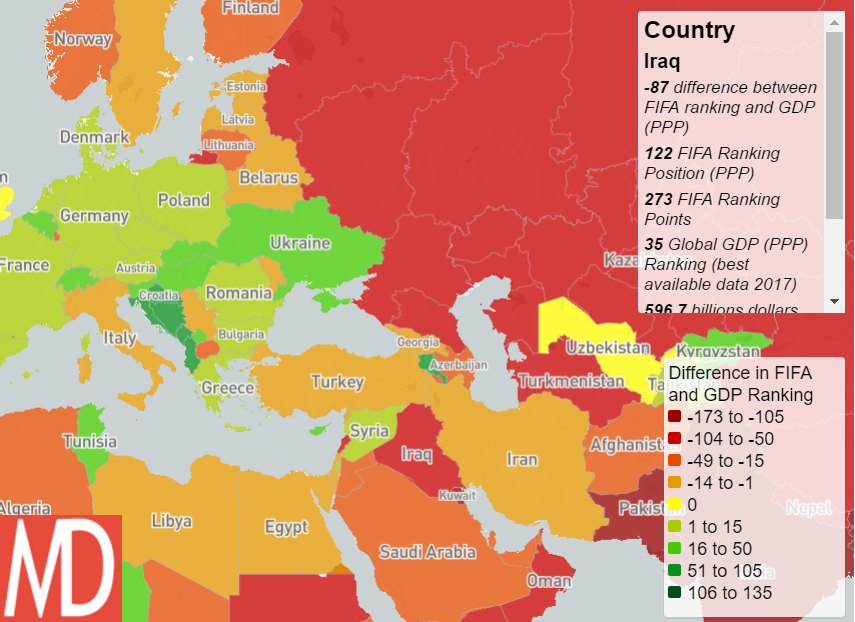
Football is perhaps the true global game, but is it played on a level playing field, particularly economically? Most of you probably know the answer to this, but the relationship between performance and strength economically, and sporting ability and opportunity is still an interesting one. National team football is a better way to analyse this, given the great financial disparities in club football to buy the best talent and that national identity is a more static attribute. Now, I realise that some may love football/sport, some may loathe or have little interest for it. However, exploring the relationship between football and economics tells us something deeperRead More →

Polder and Wiser – The Netherlands

2017-03-18
By: TheMole19
On: March 18, 2017
In: gis, maps, My Maps, Uncategorized
Tagged: dtm, dutch, engineering, flood, flooding, geography, geospatial, gis, mapping, maps, nederlands, netherlands, OriginalContent, raster, water, zonalstats
With: 0 Comments

I’m a self confessed Dutchophile. There’s something about the colour ‘Oranje’, the unique sound of the language (which I’m ‘trying’ to learn), the windmills, clogs, tulips, hagelslag, stroopwafels, Edam cheese and (until recently challenged) liberal attitudes. I feel there is much to admire about the resourcefulness of the people of the Netherlands, once a economic powerhouse in the 1600s, where making the most of limited land has been vital. This was particularly embodied by the philosophy of ‘Totaal’, where the ability of space to have multiple uses influenced (particularly architectural) philosophies within the general liberal Dutch culture of the 20th Century. Famously, this was reflectedRead More →

06. Map of The Day – The Shape of Slavery

2017-03-16
By: TheMole19
On: March 16, 2017
In: gis, Map of the Day, maps, Uncategorized
Tagged: culture, gis, mapping, maps, Motd, politics, Population, racism, usa, web development
With: 0 Comments

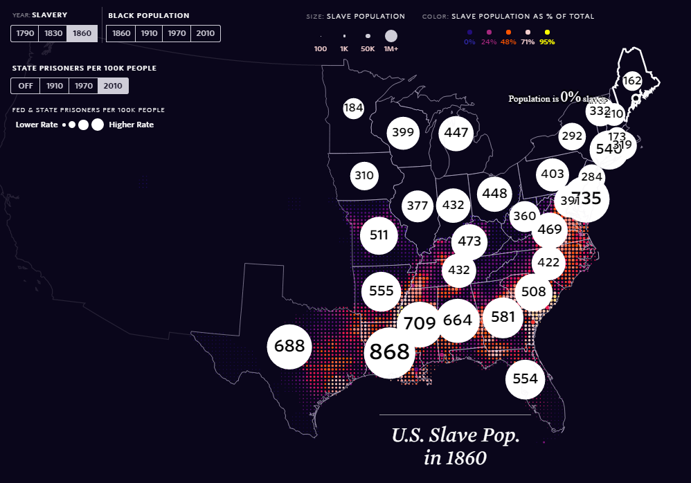
It’s been a while since I’ve added to this feature for various reasons, but thanks to the ‘The Pudding‘, a superb infographics and ‘visual essay’ based site, there is a excellent and important entry for Map of the Day. The Shape of Slavery evidences historical and modern day racism, by providing geographical representations of the areas of United States of America where proportion of African-Americans have been over time, the numbers of slaves up until it was outlawed, and the number of (black) incarcerations per state. This is a well designed and thought out web map, which utlises topojson.js and other Javascript libraries, to tie inRead More →

Cartogram of Female Workforce

Celebrating International Women’s Day 2017 – Mapping Insights

2017-03-08
By: TheMole19
On: March 8, 2017
In: gis, maps, My Maps
Tagged: analytics, employment, feminism, gis, mapping, maps, OriginalContent, politics, statistics, women, world
With: 0 Comments

Another day, and another ‘international [insert here] day’. However, unlike ‘International Toast Day’ (15th July for those interested), today, 8th March, was one that actually had great significance – International Women’s Day. Despite being a guy,  I recognise that while progress has been made, we are still some way of gender equality. Given that 50% of the world’s population is female, and there is no logical reason why income, job, social, educational opportunities and choices shouldn’t be the same as men – this situation isn’t good enough. However I don’t feel I should go on further, as I don’t think I can do the topic ofRead More →

Mapping the Arctic Circle – Then and Now

2017-03-08
By: TheMole19
On: March 8, 2017
In: gis, maps, News
Tagged: arctic, cartography, geospatial, gis, greenland, imagery, mapping, maps, old maps, satellite, sentinel
With: 0 Comments

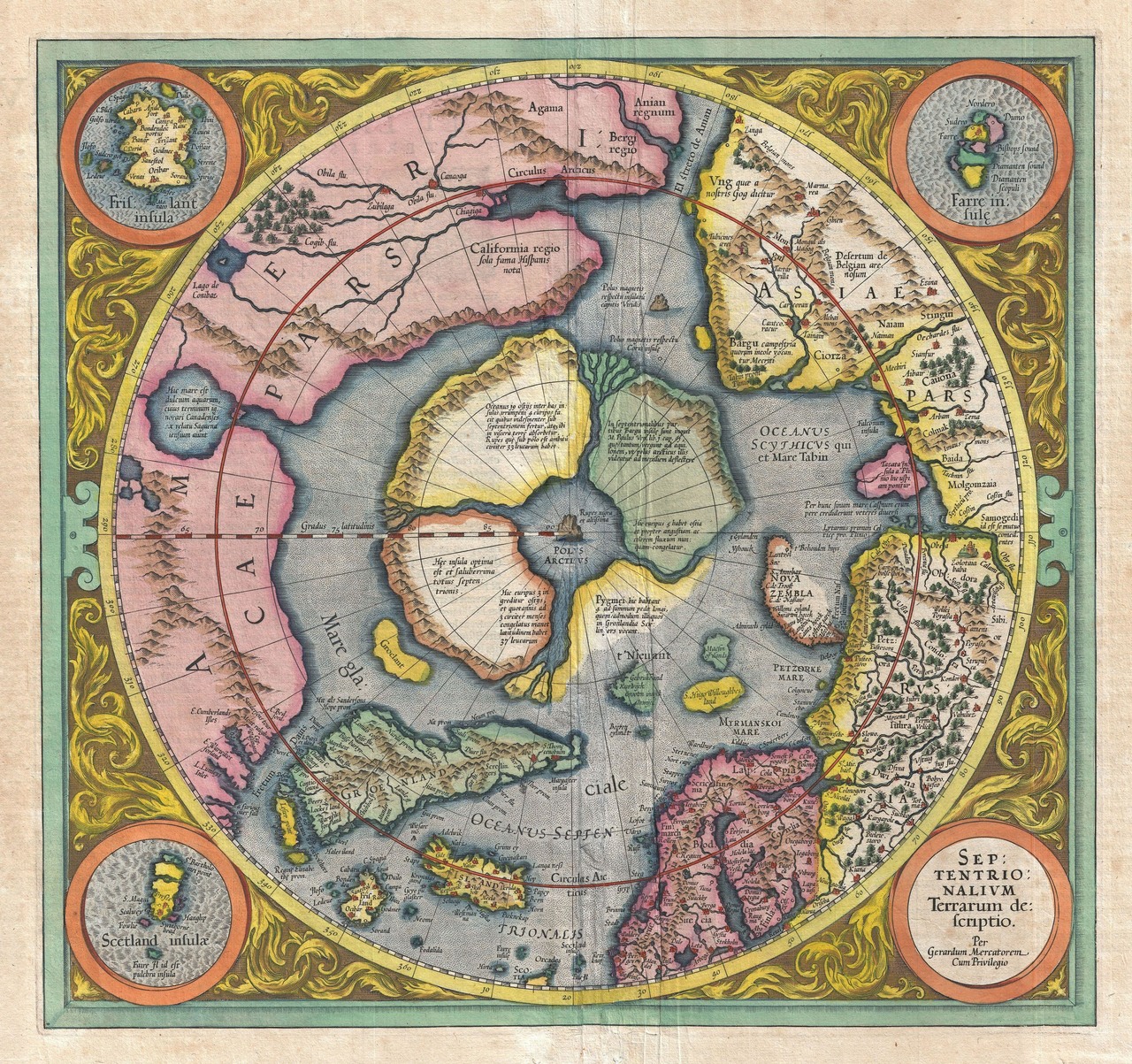
Mapping of the Arctic region has historically proved to be a challenge for cartographers and geo-scientists, though as referred to in a previous article (see here),  local knowledge is valuable in contributing to knowledge of the often perceived ‘wilderness’ by ‘Westerners’. In many ways, as alluded to in Alastair Bonnett’s brilliant book, Off the Map, despite living in an age of digital mapping, there is much geographic knowledge still to be discovered. This is perhaps most relevant and important, given global warming, in the Arctic region, and two recent articles associated to this piqued my interest in this area, and thought it would be aRead More →

Happy St David’s Day – Dydd Gŵyl Dewi Hapus! (Map of Wales)

2017-03-01
By: TheMole19
On: March 1, 2017
In: gis, Map of the Day, maps, Uncategorized
Tagged: culture, etymology, history, mapping, maps, Wales
With: 1 Comment

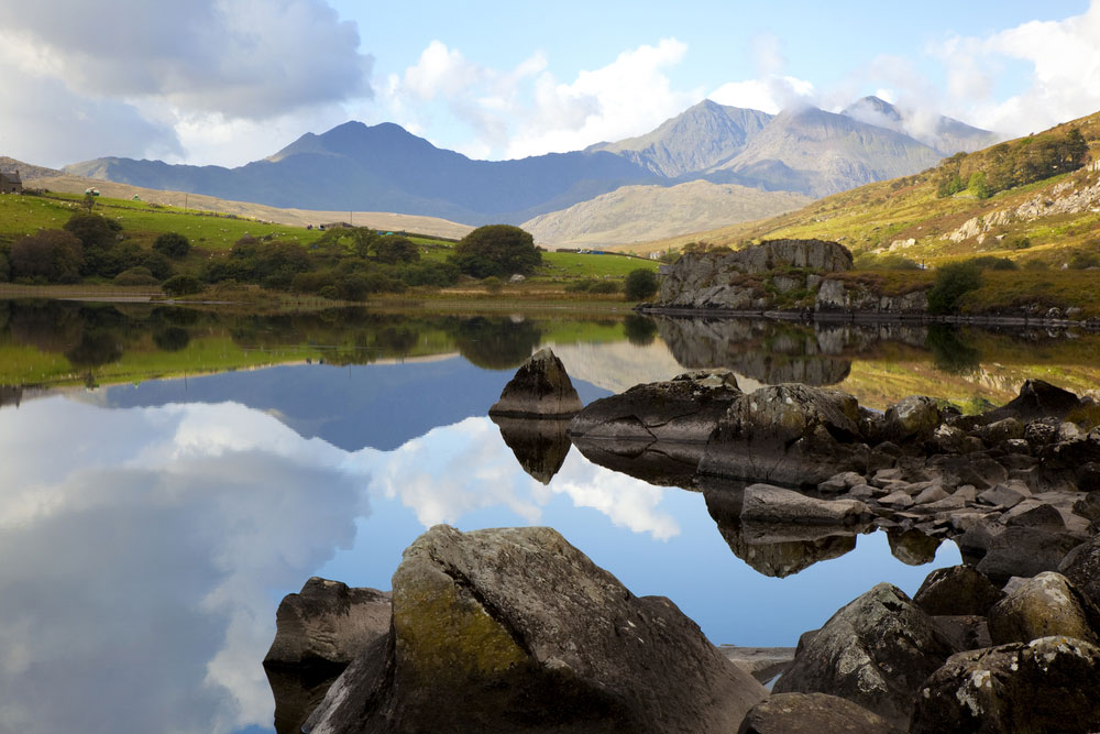
Happy St David’s Day/Dydd Gŵyl Dewi Hapus to all those around the world with Welsh links or sympathies. For those unaware, St David’s Day on 1st March,  is the national day of Wales, celebrating the saint day of the patron saint of Wales, David, and is an excuse (if ever needed) to stock up on Welsh flags, sup some Brains Beer, tuck into Welsh rarebit and Welsh cakes, and sing Calon Lân while watching reruns of Wales beating England in rugby. With all stereotypes out the way, the nation building of Wales/Cymru is an interesting one. The history is uncertain, but Wales has it’s originsRead More →

The Real Life Map Den – British Library, London

2017-02-23
By: TheMole19
On: February 23, 2017
In: gis, maps, News
Tagged: cartography, events, gis, history, maps, politics
With: 0 Comments

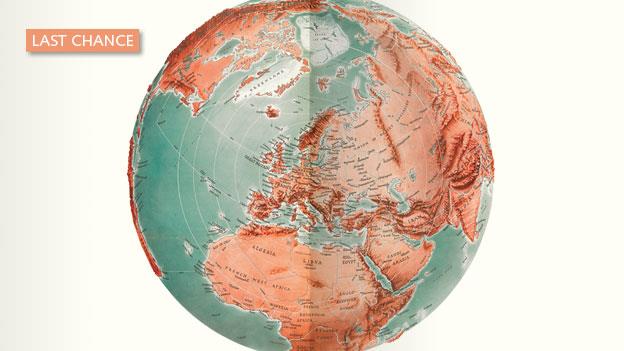
While this site lives a digital world of geographical information, there is nothing quite like going to visit a real life, physical ‘map den’, and for those who are able to, I’d highly recommend going to visit The British Library in Central London. Their map room has one of largest collections of geographical information, with approximately 4.5 million entities. This alone should be a pull factor to have a ‘map’ day in London. However, up until March 1st 2017, there is a further reason to venture down, and this is because of the fantastic “Maps and the 20th Century: Drawing the Line” exhibition which isRead More →

Urban Population Change 2010-2015

The Urban Age – Global Population Changes

2017-02-22
By: TheMole19
On: February 22, 2017
In: gis, maps, My Maps, Uncategorized
Tagged: arcgis, geography, gis, maps, OriginalContent, politics, Population, world
With: 0 Comments

One of the things I’ve enjoyed so far in creating The Map Den, is being able to share some of the latest and interesting pieces of work and tips coming out of the GIS and mapping industry. The ‘science of where‘ community is alive and strong. However, it’s time I did some original mapping content myself. Today I’m starting simple, but nonetheless importantly, looking at global urban and rural population increases. Created through static maps created in ArcGIS and joining with population data from United Nations between 2010-2015, these maps investigate the continuing phenomenon of global population increase and the urban to rural shift. WeRead More →

Aggregating points: JSON on SQL and loops on infowindows

2017-02-20
By: TheMole19
On: February 20, 2017
In: gis, maps, tips, Uncategorized
Tagged: carto, gis, json, maps, sql, web development
With: 0 Comments

Fantastic bit of code and tutorial about aggregating point data for JSON objects using SQL. geomaticblog NOTE: I’ll use CARTO but you can apply all this to any webmapping technology backed by a modern database. Get all the data So we start with the typical use case where we have a one to many relationship like this: Easy peasy, we have a map with many stacked points. From here you can jump to this excellent post by James Milner about dense point maps. My example is not about having thousands of scattered points that at certain zoom levels overlap. Mine is a small set ofRead More →

Posts pagination

Previous 1 … 3 4 5 Next

Site Menu

  • The Map Den
  • maps
  • data visualisation
  • My Maps
  • Music Map
    • Music Map
    • Music Map: FAQs
    • Music Map: Archive
  • About

Recent Posts

  • Santa Claus Travel Time Maps
  • Twas Brexit What Won It – Re: UK General Election 2019
  • UK General Election 2019 – Maps and Cartograms
  • How I made a Music Map
  • Mapping Music – Search and Explore

Tags

africa arcgis brazil canada carto cartography christmas climate culture data data visualisation economics england environment europe football geography geospatial germany gis history map mapbox mapping maps Motd music netherlands old maps OriginalContent politics Population quiz russia santa claus satellite sport transport travel UK urban usa Wales web development world

Designed using Dispatch. Powered by WordPress.