
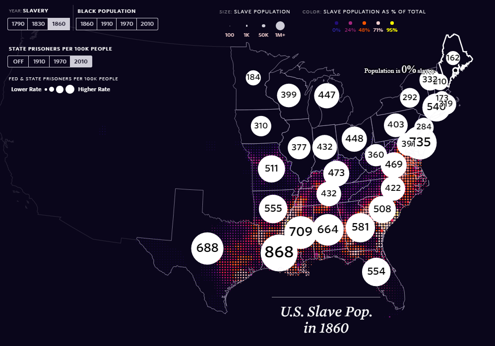
It’s been a while since I’ve added to this feature for various reasons, but thanks to the ‘The Pudding‘, a superb infographics and ‘visual essay’ based site, there is a excellent and important entry for Map of the Day. The Shape of Slavery evidences historical and modern day racism, by providing geographical representations of the areas of United States of America where proportion of African-Americans have been over time, the numbers of slaves up until it was outlawed, and the number of (black) incarcerations per state.
This is a well designed and thought out web map, which utlises topojson.js and other Javascript libraries, to tie in the (albeit) depressing history of racism, in particularly the ‘South’ of America, with geographical data to evidence this. While you can customise and turn on and off the layers you wish on the map, scrolling down through the description in the right-hand panel displays the history in maps as you read on, much like ArcGIS Story Maps. Overlaying the patterns of slavery and African American incarceration shows a strong geographical correlation between the two. This highlights that while slavery was formerly outlawed, as explained in more detail by the work of Bill Rankin and Matt Daniels who worked on this, the Jim Crow laws directly targeted former slaves after the civil war.
Segregation and racially biased police practices (arguably still today), particularly in the South, perpetuated racism, injustice and inequality for African Americans. As strongly argued and evidenced in this striking infographic and by the fantastic award winning documentary, ‘The 13th‘, racially biased cultures and systems of incarceration are a continuation of African American slavery practices. Therefore, in USA, but also round the world, we still live in a geography shaped by historical context and inequality. Indeed, slavery still exists in many parts of the world. There is much statistical and cultural evidence to highlight these discriminatory patterns, such as biased media representation to name a few, but this is beyond the scope of a geospatial website. This is a visually and technically striking map, first off, but it also shows the power of maps to geographically evidence and highlight social and morally important challenges which continue today.
Happy Mapping,
David