
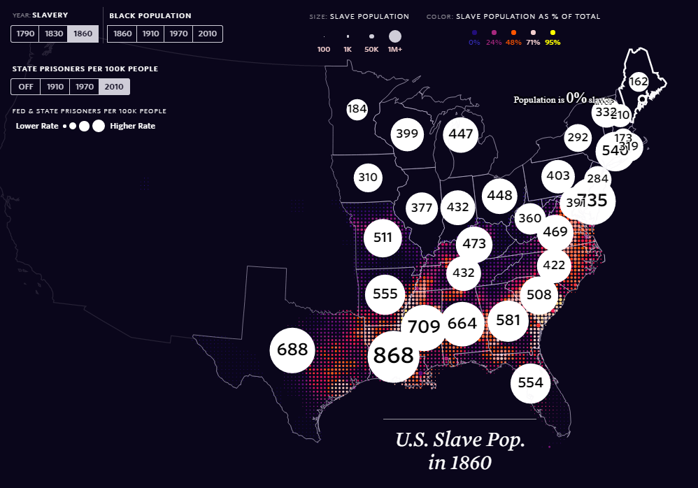
06. Map of The Day – The Shape of Slavery
2017-03-16
It’s been a while since I’ve added to this feature for various reasons, but thanks to the ‘The Pudding‘, a superb infographics and ‘visual essay’ based site, there is a excellent and important entry for Map of the Day. The Shape of Slavery evidences historical and modern day racism, by providing geographical representations of the areas of United States of America where proportion of African-Americans have been over time, the numbers of slaves up until it was outlawed, and the number of (black) incarcerations per state. This is a well designed and thought out web map, which utlises topojson.js and other Javascript libraries, to tie inRead More →