Skip to content
The Map Den
The Map Den

Mapping the latest interests in the GIS, Mapping, geography and anything in between.

Primary Navigation Menu
Menu
  • The Map Den
  • maps
  • data visualisation
  • My Maps
  • Music Map
    • Music Map
    • Music Map: FAQs
    • Music Map: Archive
  • About

politics (Page 2)

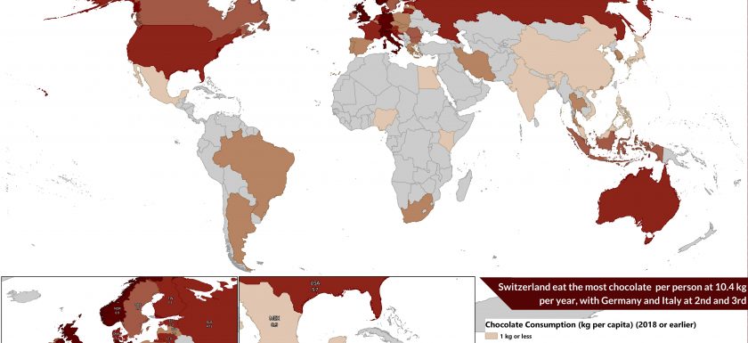
Global Chocolate Consumption per Capita (2018)

Chocolate Maps? Sweet! – Geography of Chocolate

2018-04-02
By: TheMole19
On: April 2, 2018
In: maps, My Maps
Tagged: africa, agriculture, chocolate, climate, cote d'ivoire, economics, environment, europe, geography, ghana, gis, indonesia, map, mapping, mexico, OriginalContent, politics, swizterland, UK, world
With: 0 Comments

I Should Cocoa… Ugh. I’ve had too much chocolate. I’m writing this on Easter Sunday, surrounded by temptation in the form of several variations and combinations of chocolate, as is customary in the Western world at this time of year. It turns out you can have too much of a good thing – real ‘first world problems’. Talking of #firstworldproblems, chocolate addiction really is an issue for the developed world, where chocolate consumption is at its highest in this part of world – maps bear this out. So given this time of  year, I thought it would be fitting to look into the geographical patternsRead More →
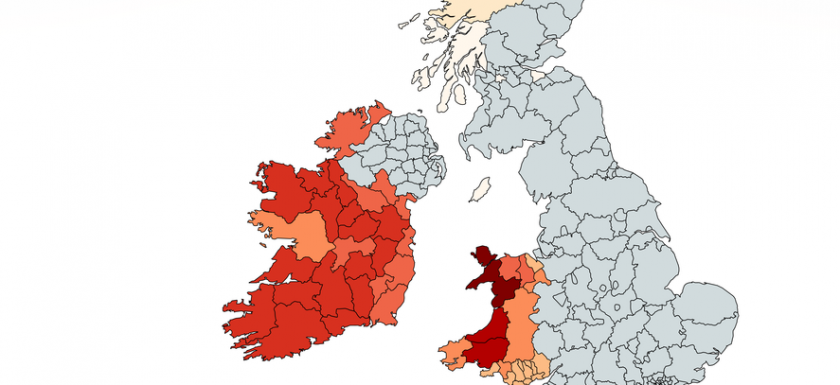
Map of knowledge of Celtic language

Mind your Language – Geography of ‘Celtic’ languages

2017-10-21
By: TheMole19
On: October 21, 2017
In: maps, My Maps
Tagged: Brittany, Catalonia, Cornwall, culture, France, geography, history, Ireland, Isle of Man, language, politics, Scotland, UK, Wales
With: 0 Comments

Croeso! Fáilte! Degemer mat! Failt ort! Dynnargh dhis! If you managed to work out the languages in the above greetings without Google, congratulations! For those who needed to Google (including myself), will know for the record that the above all means ‘Welcome’ in Welsh, Irish Gaelic/Scots Gaelic, Breton, Manx and Cornish respectively. However, despite being ‘native’ languages to their respective regions of the British Isles and Northern France with long histories, they are minority languages compared to English and French respectively, with differing fortunes and histories. In a previous article exploring the geography of Wales, we have seen how the Welsh language is a historical link to pre Angl0-SaxonRead More →

Dull Twinned with Boring

A Tale of Twin Cities

2017-06-24
By: TheMole19
On: June 24, 2017
In: gis, maps, My Maps
Tagged: carto, cities, culture, europe, gis, mapping, maps, OriginalContent, politics, Population, sister, twin, twincities, UK, urban, web development, world
With: 0 Comments

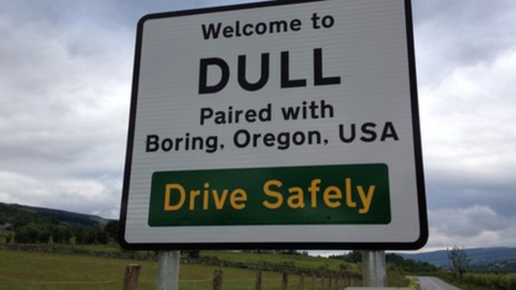
Welcome to ‘Twin City’ Enter most towns, cities or villages in not just the UK, but in Europe and beyond, and you will likely find a ‘Welcome to [insert place name]’ and underneath ‘Twinned with [insert twin cities]’. Perhaps it is easy ignore these twin cities and linkages, or dismiss them as nothing more than symbolic, but what is the story behind twin or sister cities and what does it mean today? For those unaware a twin or sister city partnership is where there is a ‘friendship’ and legal/social agreement between one town or city (or even a region) to another , usually in a different country.Read More →

Conflict_EventType_Mali

MapNation – Mali – Frontier Country

2017-06-03
By: TheMole19
On: June 3, 2017
In: gis, MapNation, maps
Tagged: africa, geospatial, gis, history, mali, maps, OriginalContent, politics
With: 0 Comments

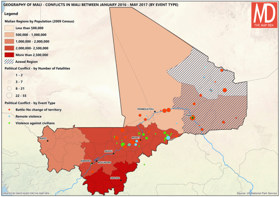
In new series, ‘Map Nation’, I choose a country at random, and use this a topic to create maps related to this country. First, out of the hat – Mali Tim Marshall in his excellent book, ‘Prisoners of Geography’, underlines the importance and much overlooked influence of geography on the history of the world and modern geopolitics. Among many great examples, include Russia and it’s need for a warm sea port, or Europe, where terrain, climate and rivers created the multitude of countries and cultures in a relatively small land mass. Another example of historical and geography’s persisting impact today is perhaps no greater than inRead More →

06. Map of The Day – The Shape of Slavery

2017-03-16
By: TheMole19
On: March 16, 2017
In: gis, Map of the Day, maps, Uncategorized
Tagged: culture, gis, mapping, maps, Motd, politics, Population, racism, usa, web development
With: 0 Comments

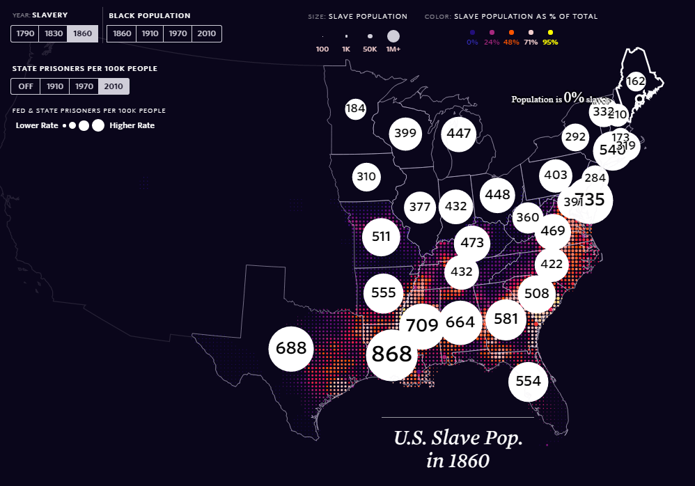
It’s been a while since I’ve added to this feature for various reasons, but thanks to the ‘The Pudding‘, a superb infographics and ‘visual essay’ based site, there is a excellent and important entry for Map of the Day. The Shape of Slavery evidences historical and modern day racism, by providing geographical representations of the areas of United States of America where proportion of African-Americans have been over time, the numbers of slaves up until it was outlawed, and the number of (black) incarcerations per state. This is a well designed and thought out web map, which utlises topojson.js and other Javascript libraries, to tie inRead More →

Cartogram of Female Workforce

Celebrating International Women’s Day 2017 – Mapping Insights

2017-03-08
By: TheMole19
On: March 8, 2017
In: gis, maps, My Maps
Tagged: analytics, employment, feminism, gis, mapping, maps, OriginalContent, politics, statistics, women, world
With: 0 Comments

Another day, and another ‘international [insert here] day’. However, unlike ‘International Toast Day’ (15th July for those interested), today, 8th March, was one that actually had great significance – International Women’s Day. Despite being a guy,  I recognise that while progress has been made, we are still some way of gender equality. Given that 50% of the world’s population is female, and there is no logical reason why income, job, social, educational opportunities and choices shouldn’t be the same as men – this situation isn’t good enough. However I don’t feel I should go on further, as I don’t think I can do the topic ofRead More →

The Real Life Map Den – British Library, London

2017-02-23
By: TheMole19
On: February 23, 2017
In: gis, maps, News
Tagged: cartography, events, gis, history, maps, politics
With: 0 Comments

While this site lives a digital world of geographical information, there is nothing quite like going to visit a real life, physical ‘map den’, and for those who are able to, I’d highly recommend going to visit The British Library in Central London. Their map room has one of largest collections of geographical information, with approximately 4.5 million entities. This alone should be a pull factor to have a ‘map’ day in London. However, up until March 1st 2017, there is a further reason to venture down, and this is because of the fantastic “Maps and the 20th Century: Drawing the Line” exhibition which isRead More →

Urban Population Change 2010-2015

The Urban Age – Global Population Changes

2017-02-22
By: TheMole19
On: February 22, 2017
In: gis, maps, My Maps, Uncategorized
Tagged: arcgis, geography, gis, maps, OriginalContent, politics, Population, world
With: 0 Comments

One of the things I’ve enjoyed so far in creating The Map Den, is being able to share some of the latest and interesting pieces of work and tips coming out of the GIS and mapping industry. The ‘science of where‘ community is alive and strong. However, it’s time I did some original mapping content myself. Today I’m starting simple, but nonetheless importantly, looking at global urban and rural population increases. Created through static maps created in ArcGIS and joining with population data from United Nations between 2010-2015, these maps investigate the continuing phenomenon of global population increase and the urban to rural shift. WeRead More →

2. Map of the Day: How much does your vote count?

2017-02-03
By: TheMole19
On: February 3, 2017
In: Map of the Day, maps, Uncategorized
Tagged: democracy, geography, mapping, maps, Motd, politics, web development
With: 0 Comments

Today’s map of the day touches on the thorny issue of…politics, though I’m not going to get into a political discussion; if you want to, please got the usual channels, i.e. YouTube comments section. This map from the Economist Intelligent Unit’s (EIU) Democracy Index is a simple, clear, but informative map (click here for full interactive version here).Read More →

Posts pagination

Previous 1 2

Site Menu

  • The Map Den
  • maps
  • data visualisation
  • My Maps
  • Music Map
    • Music Map
    • Music Map: FAQs
    • Music Map: Archive
  • About

Recent Posts

  • Santa Claus Travel Time Maps
  • Twas Brexit What Won It – Re: UK General Election 2019
  • UK General Election 2019 – Maps and Cartograms
  • How I made a Music Map
  • Mapping Music – Search and Explore

Tags

africa arcgis brazil canada carto cartography christmas climate culture data data visualisation economics england environment europe football geography geospatial germany gis history map mapbox mapping maps Motd music netherlands old maps OriginalContent politics Population quiz russia santa claus satellite sport transport travel UK urban usa Wales web development world

Designed using Dispatch. Powered by WordPress.