
Set for departure…

*DING DONG* “The train now arriving at platform 2 is the (delayed) 1743 service to London Paddington calling at…”
I’ve been spending a lot more time at train stations recently – starting a new job in a different city with a new commute, as well as travelling to see friends etc. Sometimes it can be frustrating waiting in the cold through delays for the next train, or weaving through commuters in the hope of getting a seat. However, being from a railway-boom town like Swindon, I do feel a certain affinity for the railway. But the geographer in me has often wondered whether the geography of stations and services meets demand and if they spatially appropriate.
Is it just a perception that some relatively small settlements in affluent or commuter areas retain stations, whilst other parts of the UK have an unexpectedly low density of stations? Much like Clarbeston Road to Didcot Parkway, there is no direct route to answer this, but given a few maps we may get closer to our destination…
Train has been cancelled…

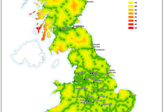
A first simple analysis to do is to look at the distances to train stations, and as we can see in the above map, this roughly follows concentration of population, as the majority of areas within major population centres like London, Birmingham, Manchester, Glasgow-Edinburgh are within one mile of a station. Meanwhile, areas of Ceredigion and North Cornwall are 25 miles away from a train station, while areas of Scottish Borders, the Highlands and Aberdeenshire and further away than this. But maybe this is to be expected – after all these are remote area with lower densities of population and lower service demand (see map below and at start of article). However, this does not tell the whole story – look closely areas such as West Oxfordshire or Uttlesford (Bishop’s Stortford) and you will see that they have similar population densities to these areas, yet have a greater service and proximity to stations.

This hints at an uneven distribution of stations in regards to demand and population density. In the 1960s in the UK, for various reasons, such as rising levels of private transport, costs and (maybe politics), the chairman of British Railways, Richard Beeching, started off restructuring plans of the UK train network. Known as the ‘Beeching Axe‘, as much as 4,000 miles of routes were cut on efficiency grounds. By 1983, the UK rail network looked very different, and it is important to note that while there are arguments for and against this, the ‘axe’ didn’t fall evenly. While this is a ‘rough’ form of analysis, the map below shows the population per station/UK district or unitary authority, and whilst not perfect, this provides interesting insight.
Train coming into Central station…

Ideally, this map would be completely light pink, and indeed major urban centres like Greater London, Glasgow and the North-West of England and generally well provisioned according to this. However, Leicester, Hull and Swindon are among the areas with the highest population demand based on count of stations. But these aren’t isolated examples; there is unevenly high demand in areas of West and East Midlands, as well as areas of Somerset and Avon. Our earlier examples Ceredigion and Scottish Borders, while not as high as some, still have unusually high levels between 25 and 50 thousand people per station. Areas like East Dorset don’t even have a station. This hints at the classic geographer’s ‘Core and Periphery’, with prioritisation of services towards the core (London, Manchester etc), therefore benefiting affluent commuter belts surrounding, whereas more peripheral, unfavourable, remote areas are disadvantaged.
But why does this matter? Surely people can drive. Yes this certainly is the case, but not everyone can either afford or are able to drive, even if they happen to live in more affluent areas. Moreover, however this core-periphery pattern (beyond train stations), whether it is an incorrect hypothesis, let alone ‘morally’ right or wrong, is an important consideration to bear in mind with regards to socioeconomic patterns, inequality and the wider political climate.
Happy Mapping,
David
P.S.: Huge credit to doogal.co.uk for the free source of UK train stations and services data. Chris Bell’s website is a fantastic geospatial resource and treasure trove of geo-coding tools and information, including an invaluable Batch Geocoder, which I fully recommend checking out.
4 Comments